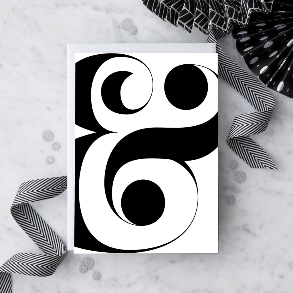
Bella Typography – WHY WE LOVE IT
Back story: Designer Rick Banks of the London design studio Face37 created Bella as a riff on the classic French typeface, Didot, with lush rounded contours and a shift in overall geometry that we think increases the sex appeal. It’s based on the work of renowned typographers, America’s John Pistilli and Herb Lubalin, and Switzerland’s Jan Tschichold.
Why’s it called Bella? Banks says, “It’s named after my beautiful wife Annabel and I think the name matches the font quite well.”
What are its distinguishing characteristics? Voluptuous curves paired with ultra thin serifs, plus some charming ball terminal alternatives in the uppercase library that mirror the terminals on the lowercase alphabet and numerals. “Tschichold’s Saskia inspired Bella’s perfect circular terminals,” says Banks. “Pistilli and Lubalin’s typeface called Pistilli Roman inspired many of Bella’s other forms, especially the very fine hairlines.”
Black & White – WHY WE LOVE IT
In a complicated world, there’s something reassuring about clean, simple black-and-white. The Design With heart product line is greatly inspired by geometrics, and fashion-forward typography. The look is modern, cool, and assertive — but never in your face.


